
Welcome to franktierney.com
I am an artist/educator seeking to unify interests in typography and painting. Painters and Letterforms was the title to my MFA thesis project at Yale.* It was meant to find commonalities between painting and typography which was sparked when I learned that the incised, stone-cut Roman inscription letters seen on the Trajan Arch were formed by a brush.
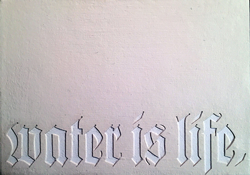
Nearly 40 years later, I still desire to unite these disparate interests of vector type on a flat surface (the screen), with painterly knife strokes on textured surface (the painted panel). What you can’t see here is the surface of this tiny oil painting and the statement “Water is Life” in low-relief Fraktur type.
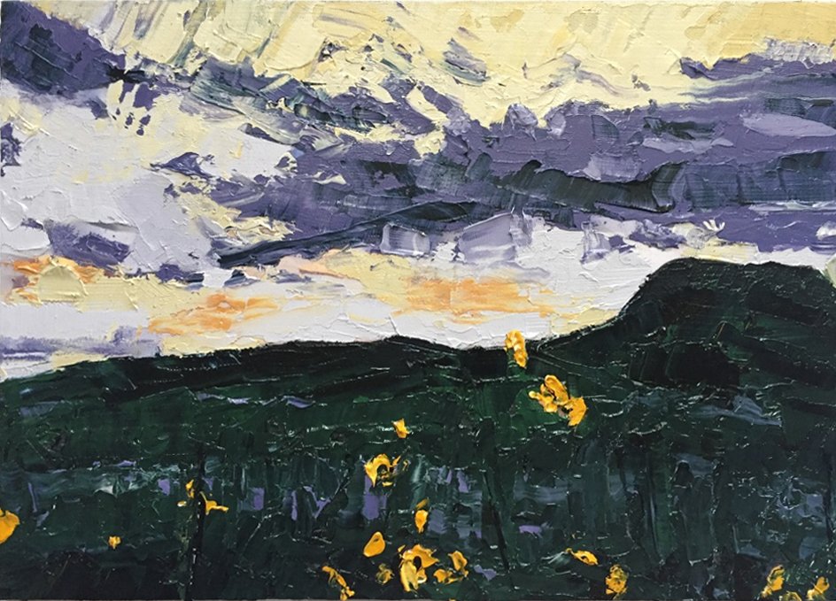
I’ve chosen plein air landscape painting as the theme here. One of my inspirations recently has been Wayne White who paints letters on top of thrift store paintings.
Speaking of thrift store finds, check out vintage paint-by-number paintings. Paint-by-number makes shape-finding easy and it fills shapes with precisely observed color. Shape-finding means asking the questions “what is the shape, color and value of a particular area of an image? This is related to the concept of stroke and fill in vector editors such as Adobe Illustrator. To quote painter/educator Charles Hawthorne, students should:
“…[concentrate] on the mechanics of putting one spot of color next to another – the fundamental thing.”
—Charles W. Hawthorne from Hawthorne on Painting
These spots can be thought of as flat, colored shapes. Ideally, if the painter can draw and fill the shape accurately, a representation is formed.
I want my landscapes to be stand-alone and give a sense of place. I’d like the viewer to be drawn in by the atmospheric quality of the image, then—maybe—notice the 3D lettering. Learning to paint the landscape takes practice, encouragement and instruction. In 2015 I took the late Mary Bentz Gilkerson’s Color and Light workshop.
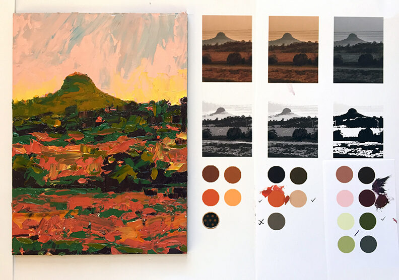
Without giving away what is not mine, Mary Gilkerson’s course introduced me to many new ideas—including Notan—the Japanese concept of patterns in black and white forming the foundation of an image.

The small thumbnail images at the bottom are, from left to right, the original reference photograph, a 5 gray-value conversion, and a two-value notan. Each of the 5 gray values was assigned a color.
Here are some others:

…and:


*The sole copy is in Box 11, 1986 of the Special Collections, Sterling Memorial Library at Yale University where it has remained unread for decades…